


Select this license type when you are developing an app for iOS, Android, or Windows Phone, and you will be embedding the font file in your mobile application's code.
Coinage Caps
by K-Type
Individual Styles from $20.00 USD
Complete family of 3 fonts: $20.00 USD

The Coinage Caps Font Family
was designed by
Keith Bates
and published by
K-Type. Coinage Caps contains
3
styles and family package options.
More about this family
- Aa Glyphs
-
Best ValueFamily Packages
- Individual Styles
- Tech Specs
- Licensing
Basic typesetting
Letter case
Numerals and scientific typesetting
Typographic variants
Reset
Per Style:
$6.66 USD
Pack of 3 styles:
$20.00 USD
About the family
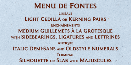
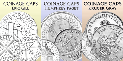
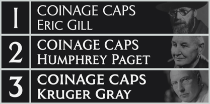
Coinage Caps is a trilogy of small caps fonts based on the Roman lettering used for the designs of British coinage. All three fonts are included in the package.
• Coinage Caps Eric Gill is a regular weight, spur serif style drawn by Eric Gill for silver coin designs in the 1920s which were rejected by the Royal Mint.
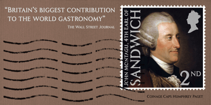
• Coinage Caps Humphrey Paget is a medium weight serif based on the lettering of Thomas Humphrey Paget, designer of the Golden Hind Halfpenny first struck in 1937. This font simulates the soft, slightly rounded corners of the minted letterforms.
• Coinage Caps Kruger Gray is a glyphic, flare serif font typical of the bold style engraved by George Kruger Gray for numerous British and Commonwealth coins during the 1920s and 30s. This font also simulates the slightly rounded corners of the minted letterforms.
Designers: Keith Bates
Publisher: K-Type
Foundry: K-Type
Design Owner: K-Type
MyFonts debut: Jun 23, 2017
Coinage Caps

About K-Type
K-Type is a small, independent type foundry based in Manchester England, offering a unique range of high quality fonts which are modestly and simply priced for designers, small businesses and large organisations.In addition to creating new typefaces resulting from formal experimentation, many K-Type fonts show the influence of inspirational artists and designers, many exploring the mix of insular and eclectic that has...
Read more